Role
UX Designer/Researcher
Responsibilities
Research
Wire-framing
User flow
Interviewing
Prototyping
Type
Independent Project
Duration
8 weeks
Tools Used:
Figma
Google Forms
FigJam
Lovely:
Helping to ease wedding planning anxiety through a customizable and intuitive experience
Problem
A quick google search of “how to plan a wedding” will provide seemingly endless amounts of resources, rules, and requirements all contradictory from the next. For newly engaged couples, wedding planning can be a stressful, time consuming, and expensive process to navigate. A couple's “special day” comes with the added weight of learning the ins and outs of event planning and balancing expectations of all stakeholders.
Solution
Create a platform that focuses directly on providing users with guidance to ease the stress involved in the wedding planning process ands offer couples clear guides develop a fully customizable event.
How might we make wedding planning feel less overwhelming to people getting married?
How might we help people getting married feel confident they have all the information they need?
Design Process
Empathize
Background
For newly engaged couples, wedding planning can be a stressful, time consuming, and expensive process to navigate. The New York Times recently deemed 2022 “The Year of the Wedding.” An estimated 2.6 millions wedding took place over the course of the year, with an average cost of $27,000 per wedding. The surge in demand (up 30% from 2021) comes amid high inflation and supply chain shortages that could add difficulty to an already complicated planning process. Lovely intends to help users manage a wide variety of concerns they may face throughout the process.
Primary Research
Five participants took park in the user interview processes. Interview participants were at various stages of wedding planning process from diverse financial backgrounds. Despite their differences all users reported a common pain point: budget management. Interviews led to the discovery that no matter the financial background, budget transparency and organization led to participants feeling “stressed” and “overwhelmed.”
Through affinity mapping, it was discovered users wanted an app that could help them keep track of their budget, guest list, vendors, and wedding timeline. They also wanted an app that provided personalized recommendations based on their wedding style and preferences.
Competitive Analysis
Initial Research consisted of competitive analysis to understand what features users would find valuable in existing wedding planning apps. Most offered easily accessible tools for customization and inspiration, but lacked an “all-in-one” experience described by participants in user interviews.
Define
Two personas were crafted to cater to distinct user groups: "Lily," a budget-conscious newly engaged person, and "Amy," a professional event planner. The process of developing these personas incorporated valuable insights gathered during affinity mapping, ensuring a comprehensive understanding of user needs and preferences.
Persona: Lily
Persona: Amy
Task Flows
The development of the following four task flows was centered around addressing pertinent user concerns and needs. By leveraging insights gathered from user interviews, each flow was thoughtfully designed to cater to specific user goals, ensuring a seamless and personalized experience throughout the wedding planning process.
Ideation
Task 1: "Create Account" aimed to streamline the registration process based on user preferences and requirements.
Task 2, "Check Budget," focused on providing users with a clear overview of their budget and expenses, allowing them to manage their finances effectively.
Task 3, "Browse Venue by Location," facilitated users in finding suitable venues based on their desired location, ensuring a convenient and personalized search experience.
Task 4, "Search Venue By Location," enabled users to search for specific venues within their preferred location, catering to their specific needs and preferences.
Site Map
Site map categories were based on feedback from cart sorting participants. The landing page included both personal planning tools as well as provides users with opportunities to explore. Both options help users make more carefully informed decisions and lessen overall planning anxiety.
Low Fidelity Wireframes
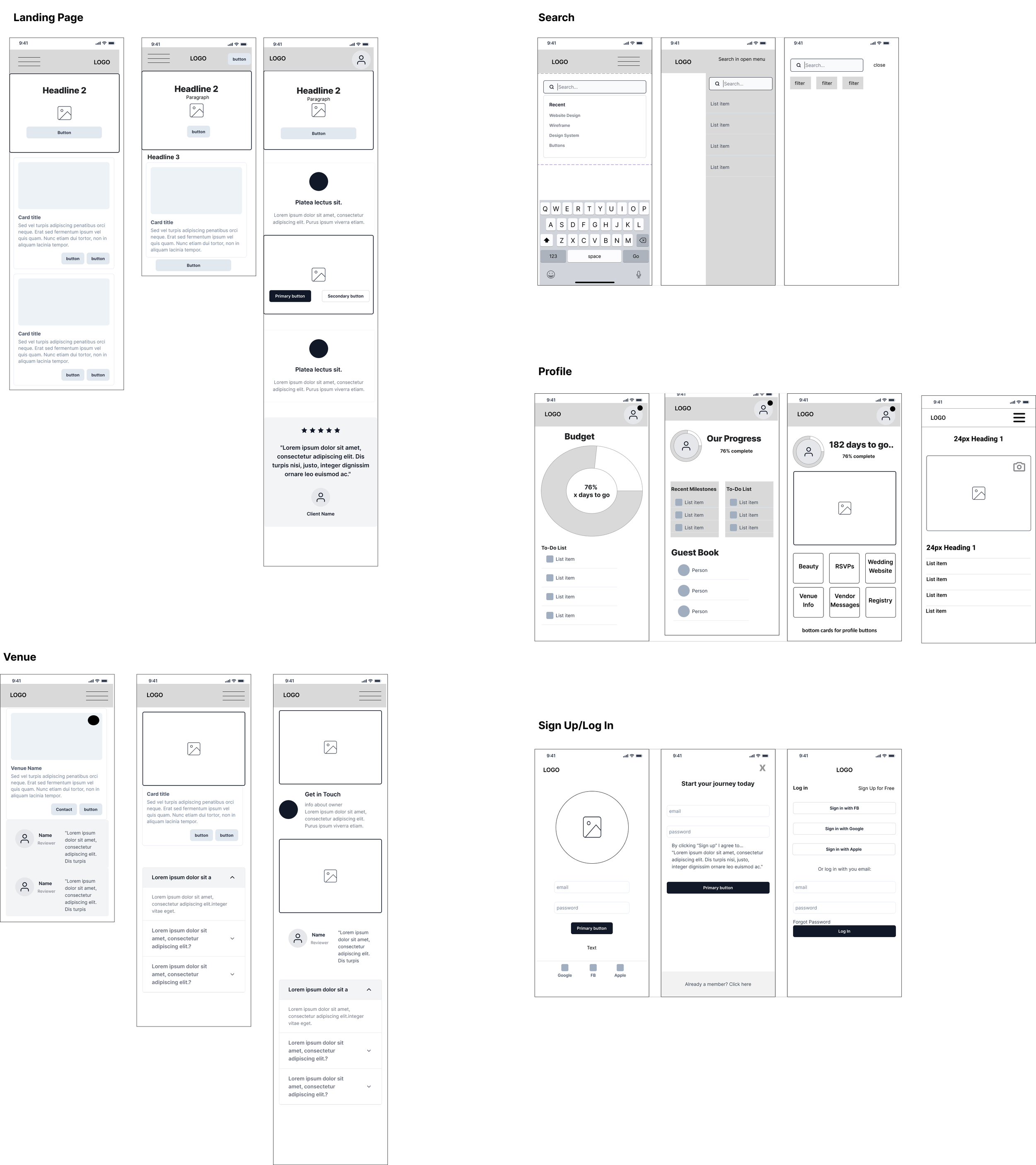
Research based wireframes were created to develop a hierarchy for key information.. Dashboard highlights include wedding checklist, budget, and vendor recommendations. A “Build you budget” feature was provided to help users visualize their budget and stay on task to reach their goals. Also included is a section for inspiration, which features highlighted venues in their area. The design was kept to be simple and intuitive, with easy-to-use navigation and clear calls to action.
The design process for the wedding planning mobile site took a comprehensive approach, integrating user research from interviews and competitive analysis. This valuable input informed the creation of a mood board that guided the visual direction, multiple logo iterations that captured the essence of the site, and the development of a UI kit for consistent and efficient design. By combining user insights, competitive analysis, and iterative design practices, the final result was a visually appealing and user-friendly mobile site that effectively catered to the specific needs of couples planning their weddings.
Visual Design
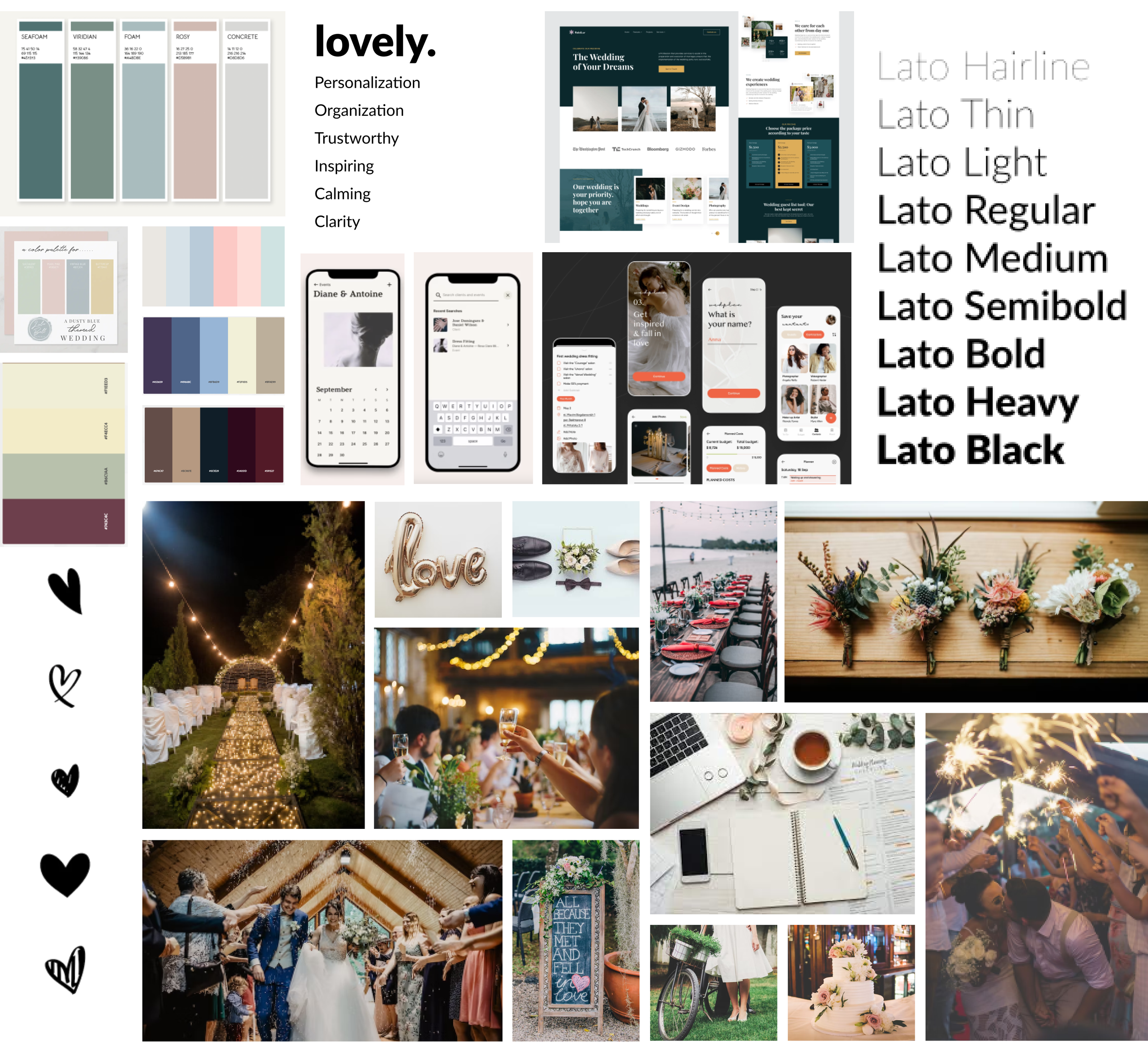
Mood Board
The creation of a mood board played a crucial role in setting a clear visual direction and guiding the user experience. Through the careful curation of inspiring images, colors, and textures, the mood board effectively conveyed the desired aesthetic and atmosphere, resulting in a harmonious and engaging user interface that deeply connects with couples preparing for their big day. Moreover, current wedding trends and colors were taken into consideration when making branding decisions, ensuring a contemporary and relevant experience.
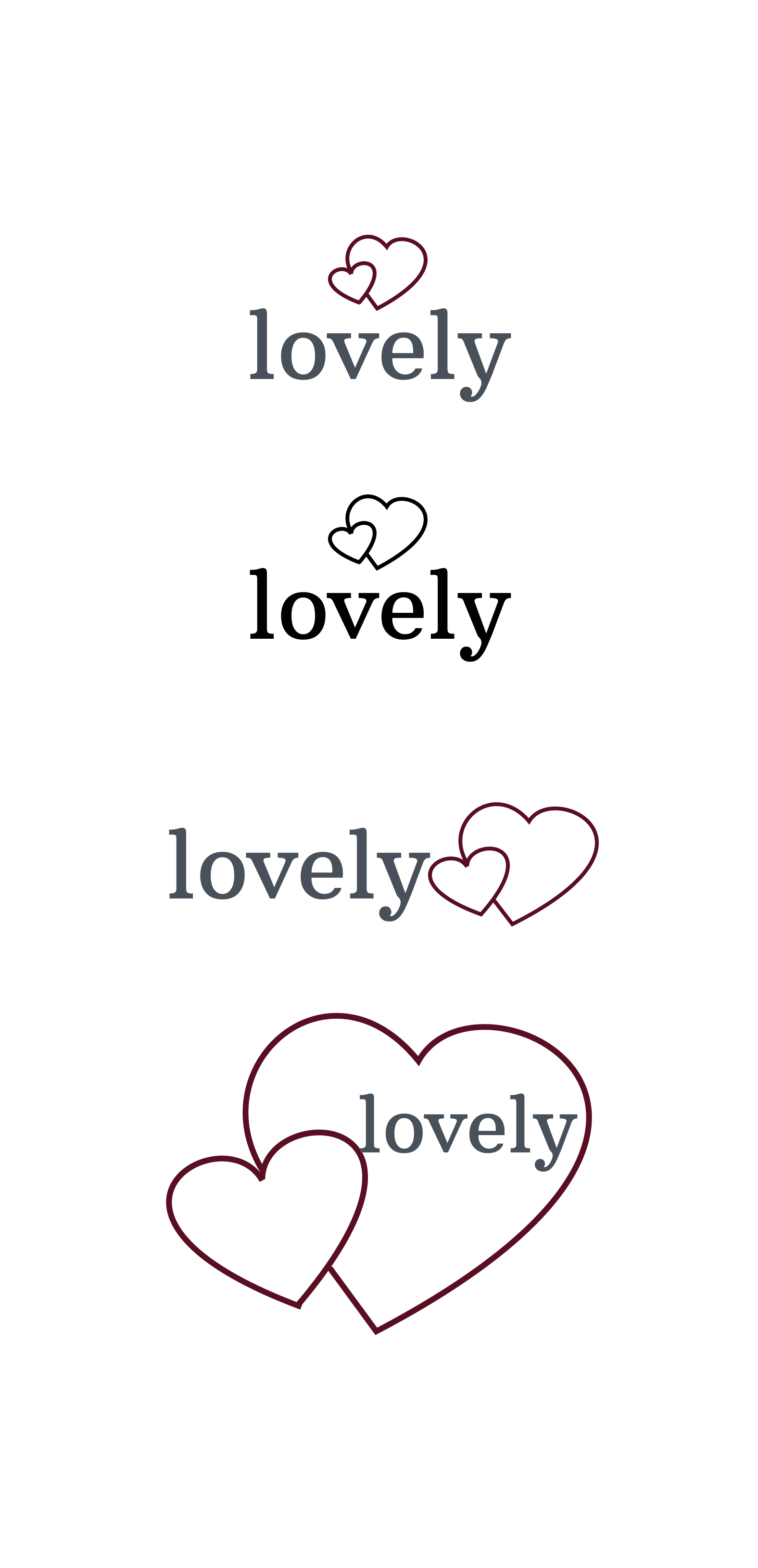
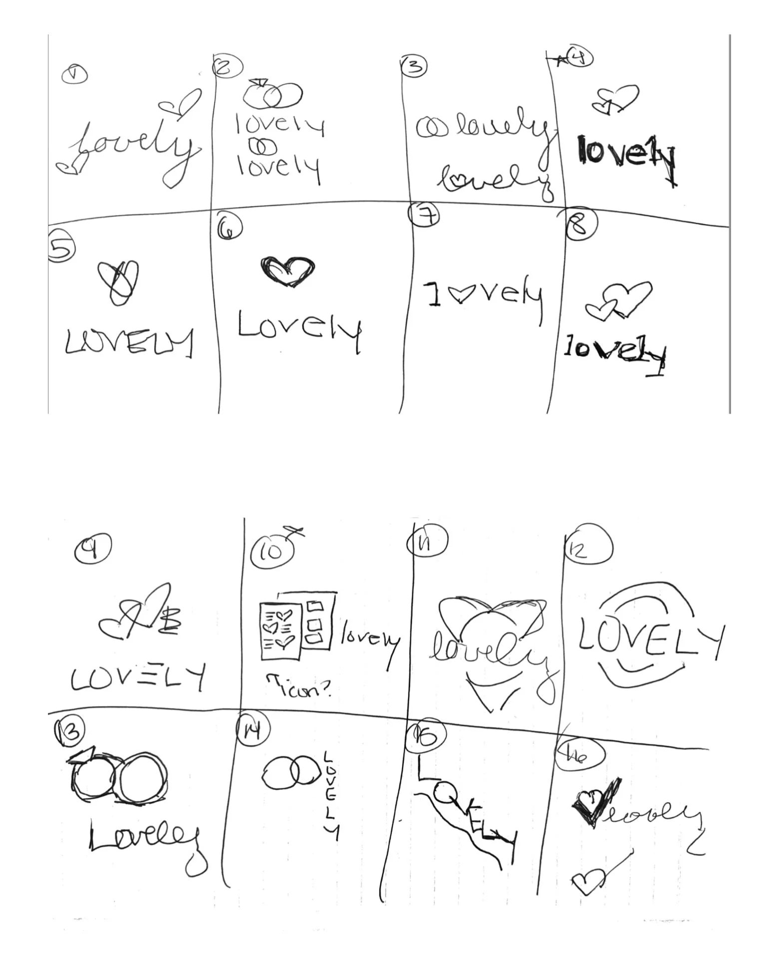
Logo Creation
Creating the logo involved an iterative process that included sketching out various concepts. By exploring different design options and refining them through feedback and iterations, a final logo was developed that visually represents the essence of the site and effectively communicates its purpose to the users.
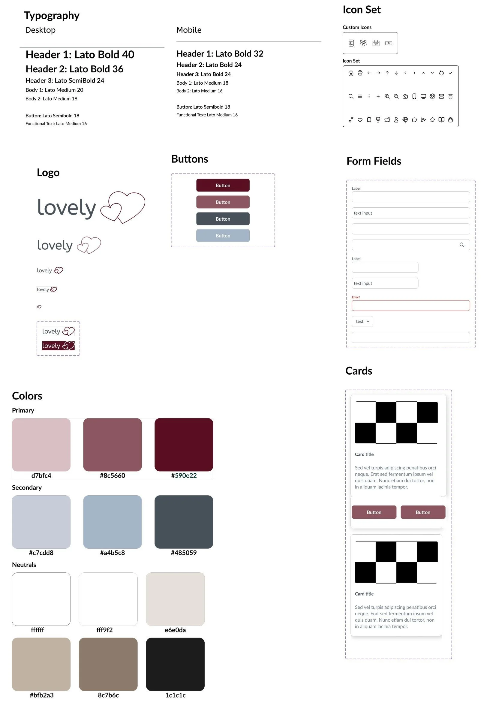
UI Kit
The UI kit was developed based on the established mood board, ensuring a consistent visual language and cohesive user experience. By incorporating the design elements, color schemes, typography, and components defined in the mood board, the UI kit provided a comprehensive set of reusable assets that streamlined the design process and maintained a harmonious and delightful interface throughout the site.
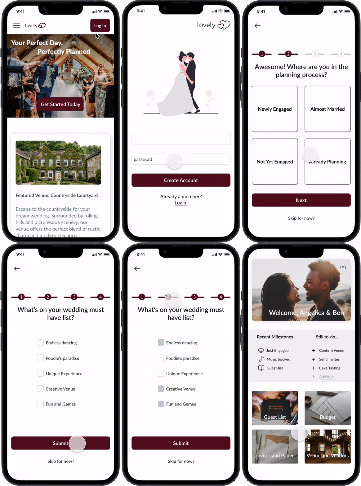
Screen Example: Create Account Quiz
Screen Example: Vendor Information
Usability Testing
Usability testing was conducted with the initial design to making sure that the site was intuitive and easy to use. Feedback from users was used to analyze results of the usability testing then incorporated into the final design. The high fidelity prototype was well-received by users, who found it to be a helpful tool in planning their weddings. The app's simple and intuitive design made it easy for users to navigate and stay organized.
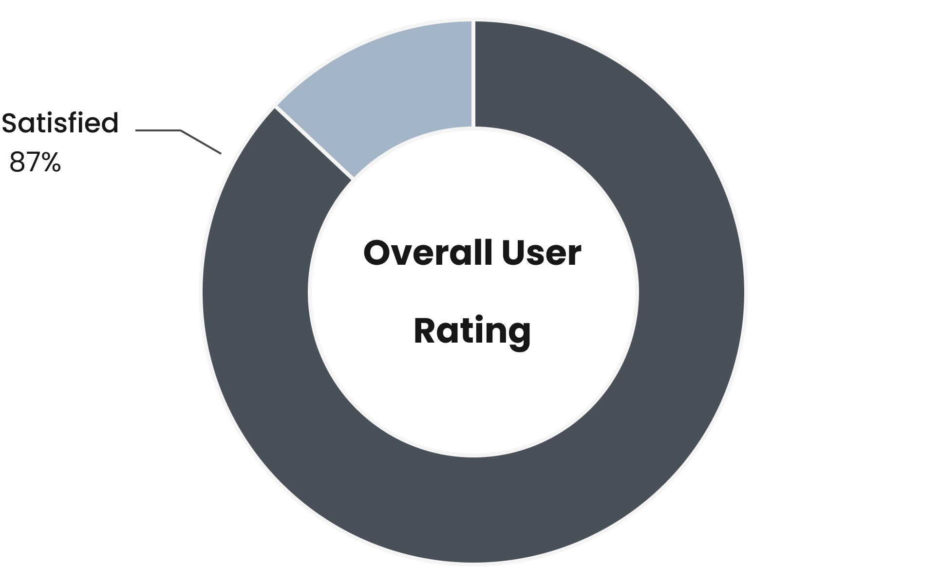
Participants had an average user satisfaction rating of 87%. Overall, the prototype was well-received by users, who found it to be a helpful tool in planning their weddings. The app's simple and intuitive design made it easy for users to navigate and stay organized. Users appreciated the explore section and the vendor recommendations, which saved them time in searching for vendors themselves. The project resulted in a successful design of the wedding planning site, which improved the user experience and ultimately eased anxiety when approaching wedding planning.
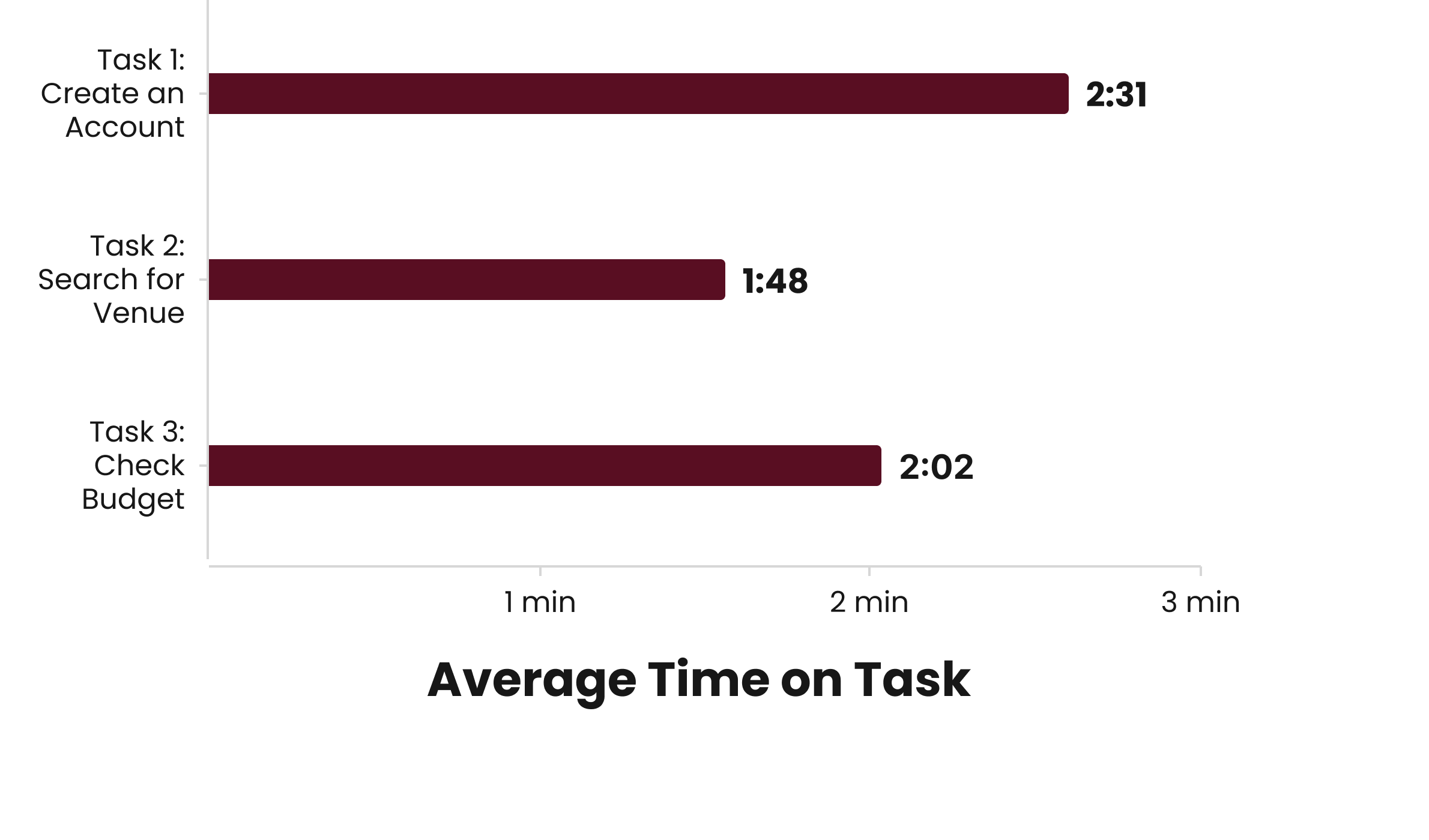
The overall task completion rate for users was an impressive 93%, indicating a high level of success. However, the analysis identified the "Search for a Venue" flow as the area with the most potential for improvement. During user testing, one participant expressed the need for an "overall venue" page before the search function, suggesting an opportunity to enhance the user experience by incorporating this feature into the flow.
High Fidelity Prototype
Creating a high-fidelity prototype was essential to effectively communicate the envisioned user experience and validate design decisions. By incorporating detailed visuals, realistic interactions, and accurate content, the high-fidelity prototype allowed for a more realistic and immersive user testing experience. This facilitated valuable feedback from potential users and stakeholders, enabling iterative improvements and ensuring a polished and user-friendly final product that meets the specific needs and expectations of couples planning their weddings.
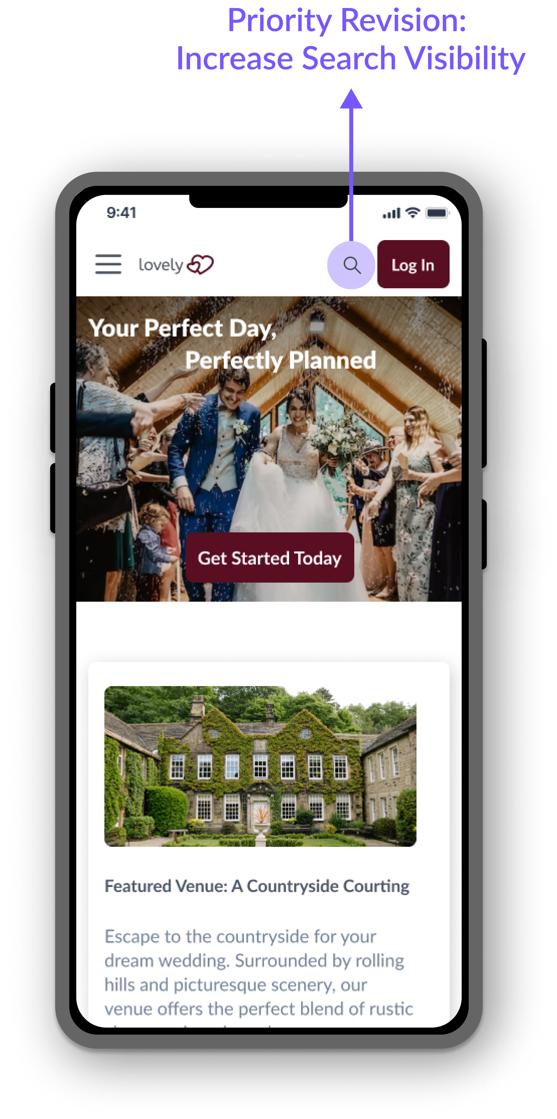
Revision 1: Increase Search Visibility
The overall feedback on the search venue flow was positive, with participants describing the interface as intuitive and easy to use. However, there were a few areas of improvement identified during testing. One participant initially took an unsuccessful path by clicking on featured venues, expressing a need for an "overall venue" page before the search function. Another participant had difficulty locating the search function, expecting it to be at the top of the page. To address these issues, revisions included a venue-specific page that includes the search function in the landing page header to increase visibility.
Priority Revisions
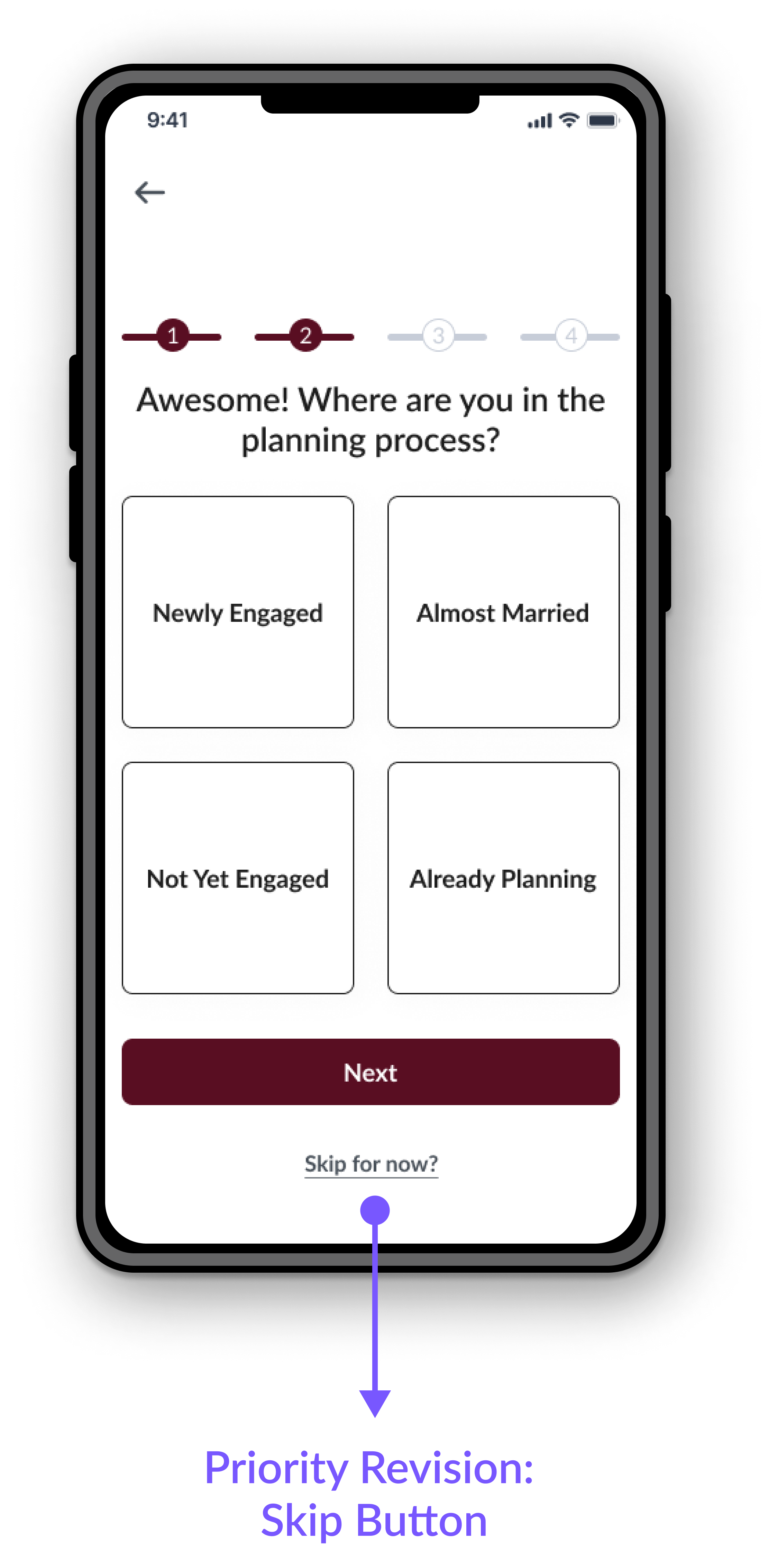
Revision 2: Opportunity to Skip Sign Up Quiz
The feedback on the sign-up process was generally positive, with participants finding the steps easy to manage. However, some users noted that there were multiple sign-up spots with friendly language, leading to confusion. One participant specifically questioned which sign-up option was the correct one. Another participant suggested implementing a one-click option to skip the onboarding quiz. Moving forward, it is recommended to assess the language used in call-to-action buttons for clarity and consider adding a one-click sign-up option with delayed profile creation.
Revision 3: Improve Budget Functionality
During user testing, three participants found success by visiting the profile page before accessing the budget page, while others used the navigation menu to find the budgeting tool. One participant raised a question about the card linking to signup instead of the budget page, only realizing the need to be logged in to view the budget. Another participant expressed a preference for a categorized graph alongside recent spending categories. To address these insights, the next steps involve improving the specificity of budgeting data, evaluating the format of the informational card, and providing an alternate pathway to access the tool. These next steps will require additional time and updated testing to ensure successful implementation.
Throughout the design process, valuable insights were gathered that guided improvements and enhancements to the overall user experience of the wedding planning mobile site, Lovely. The incorporation of a mood board, logo iterations, and a UI kit ensured a cohesive and visually appealing design. User research, including interviews and competitive analysis, provided a deeper understanding of user needs and preferences.
Looking forward, next steps involve refining the budgeting tool by incorporating more specific data and evaluating the format of the informational card. Optimizing the search for venues includes the implementation of an "overall venue" page and improving the visibility of the search function. Additionally, providing clearer guidance and options during the account creation process is crucial. By addressing these areas and continually iterating on the design, the mobile site will better meet the expectations and satisfaction of couples planning their special day.
