NYCRuns
A Mobile-First Responsive Redesign
Role
UX Designer
UX Researcher
Type
Independent Project
Duration
4 weeks
Responsibilities
Research
Wire-framing
User flow
Interviewing
Prototyping
Tools Used:
Figma
Google Forms
FigJam
Problem
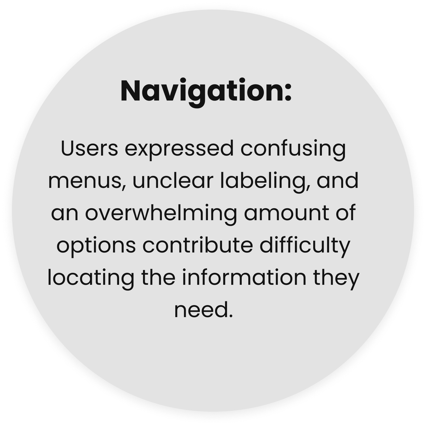
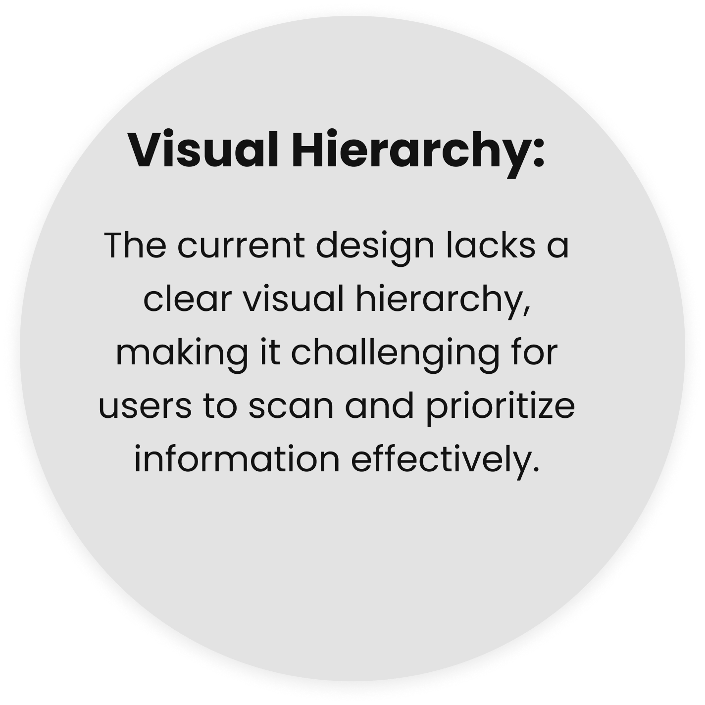
NYC Runs offers many opportunities for residents to be a part of the running community through organized races, volunteering, and training programs. The current website could be improved with increased focus on visual hierarchy and intuitive navigational flows. Currently, users may get frustrated by being unsure what their primary action should be.
Solution
Redesign the NYCRuns.com website to enhance user experience, improve functionality, and align the design with modern web standards. The goal is to create a visually appealing, user-friendly website that caters to both seasoned runners and beginners, promoting fitness, community engagement, and participation in NYC Runs' race events.
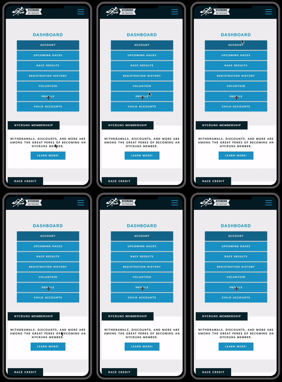
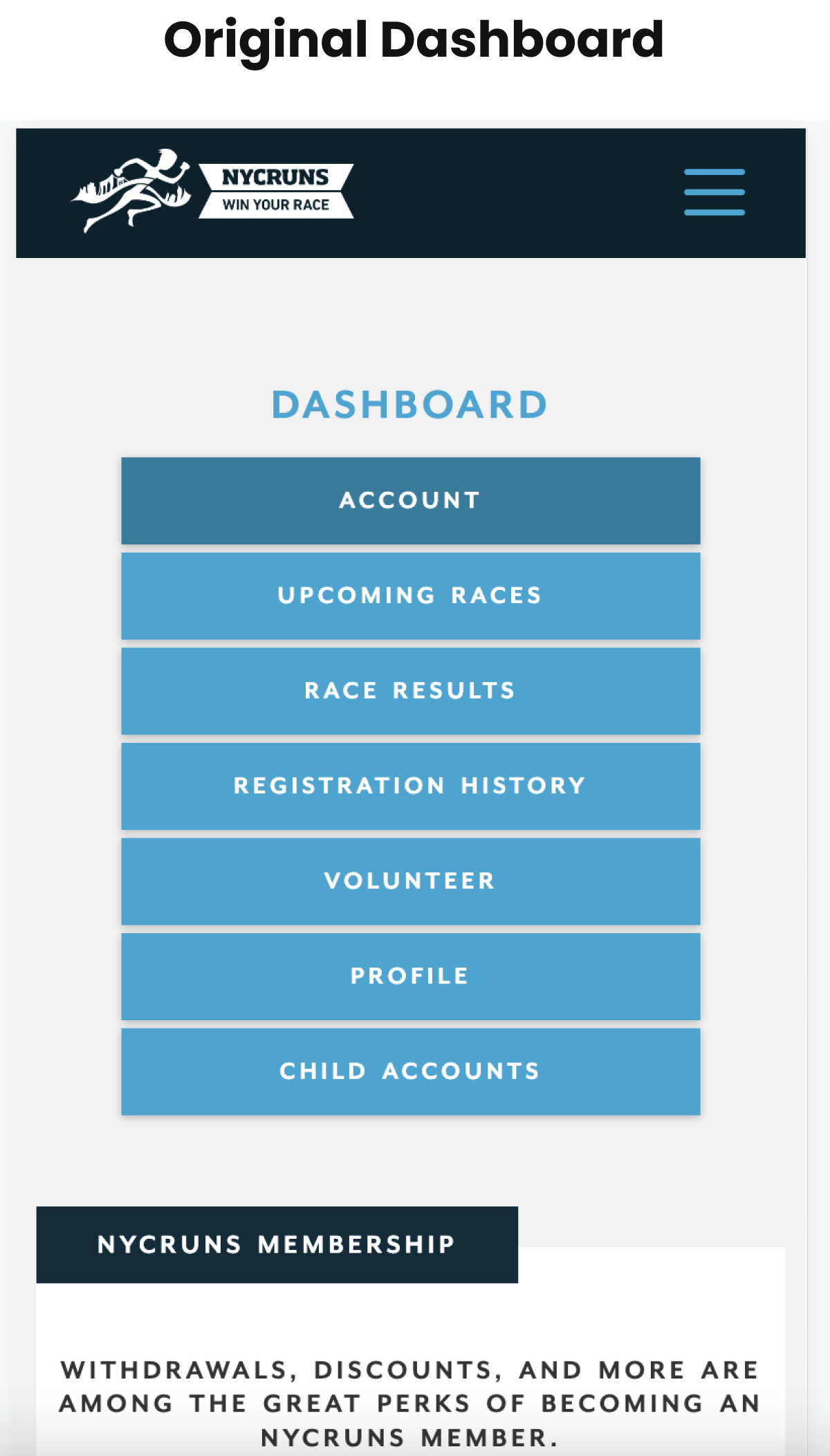
Current Mobile Dashboard Design
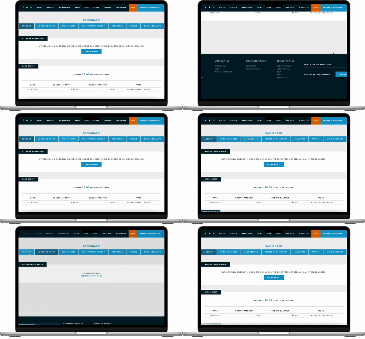
Current Desktop Dashboard Design
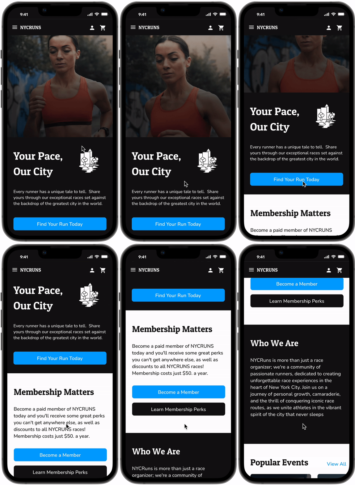
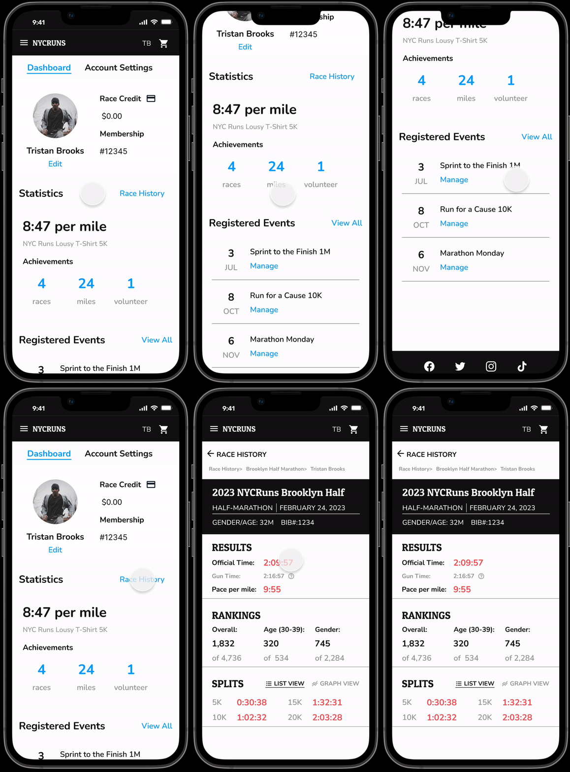
Mobile Dashboard Redesign
Desktop Dashboard Redesign
Design Process
NYC Runs is a leading organization in the New York City running community, offering a range of race events and services. They specialize in organizing and managing road races, marathons, and other competitive running events throughout the city. With a focus on promoting fitness and community engagement, NYC Runs caters to both seasoned runners and beginners, providing opportunities for participants of all skill levels to challenge themselves and achieve their fitness goals. The company is known for its well-organized and professionally executed events, with a strong emphasis on safety and participant satisfaction. NYC Runs also offers training programs, race timing services, and resources to support runners in their journey to improve their performance and overall well-being.
Empathize
Company Background
User Interviews
5 participants were interviewed during the research phase of this project. Participants varied in age (32-69), fitness goals and direct experience with running large scale races.
Interview Takeaways
Common themes discussed during interviews centered around the need for streamlined task completion.
Two personas were created to represent different user groups, such as an enthusiastic beginner runner named "Nancy" and a competitive seasoned runner named "Mark." A user journey map was developed specifically for Nancy, a beginner runner, to visualize her interactions and experiences throughout her engagement with the NYCRuns platform.
Define
Persona: Nancy
Persona: Mark
The original NYCRuns sitemap was recreated to facilitate the identification of pain points. The study revealed that visitors encountered significant challenges in locating past race results and discerning the specific race distances they were signing up for. These findings provided valuable insights for improving the platform's user experience and ensuring seamless navigation for future participants.
Ideation
Site Map Audit
Task Flow Analysis
As part of the responsive web redesign for NYCRuns.com, the following UX task flows have been optimized:
Users can easily register for races by providing necessary information and selecting desired events, ensuring a seamless registration process.
Users can conveniently check their individual race results by logging into their account and accessing a dedicated results page, allowing for quick and personalized access to race performance information.
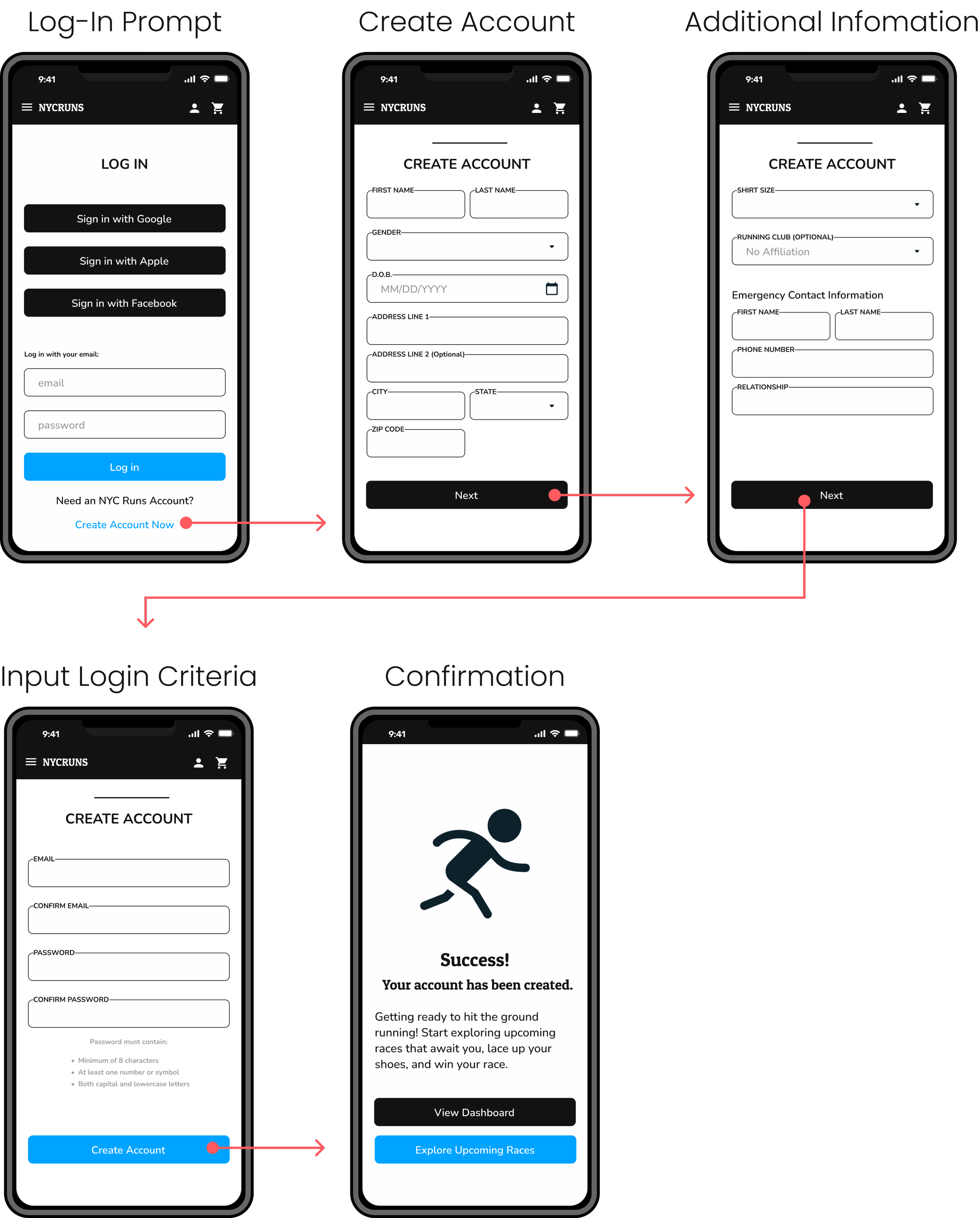
A simplified account creation process by reducing the number of steps, implementing clear error handling, and providing clear information on the benefits of creating an account, ultimately encouraging users to sign up and engage with the platform.
Task Flow 1: Register for a Race
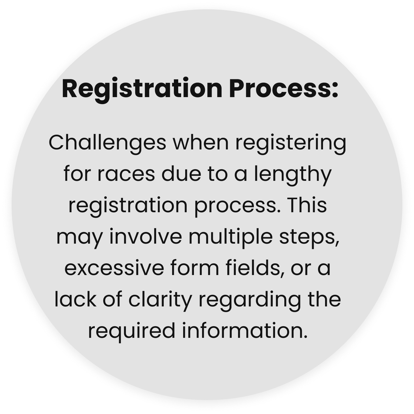
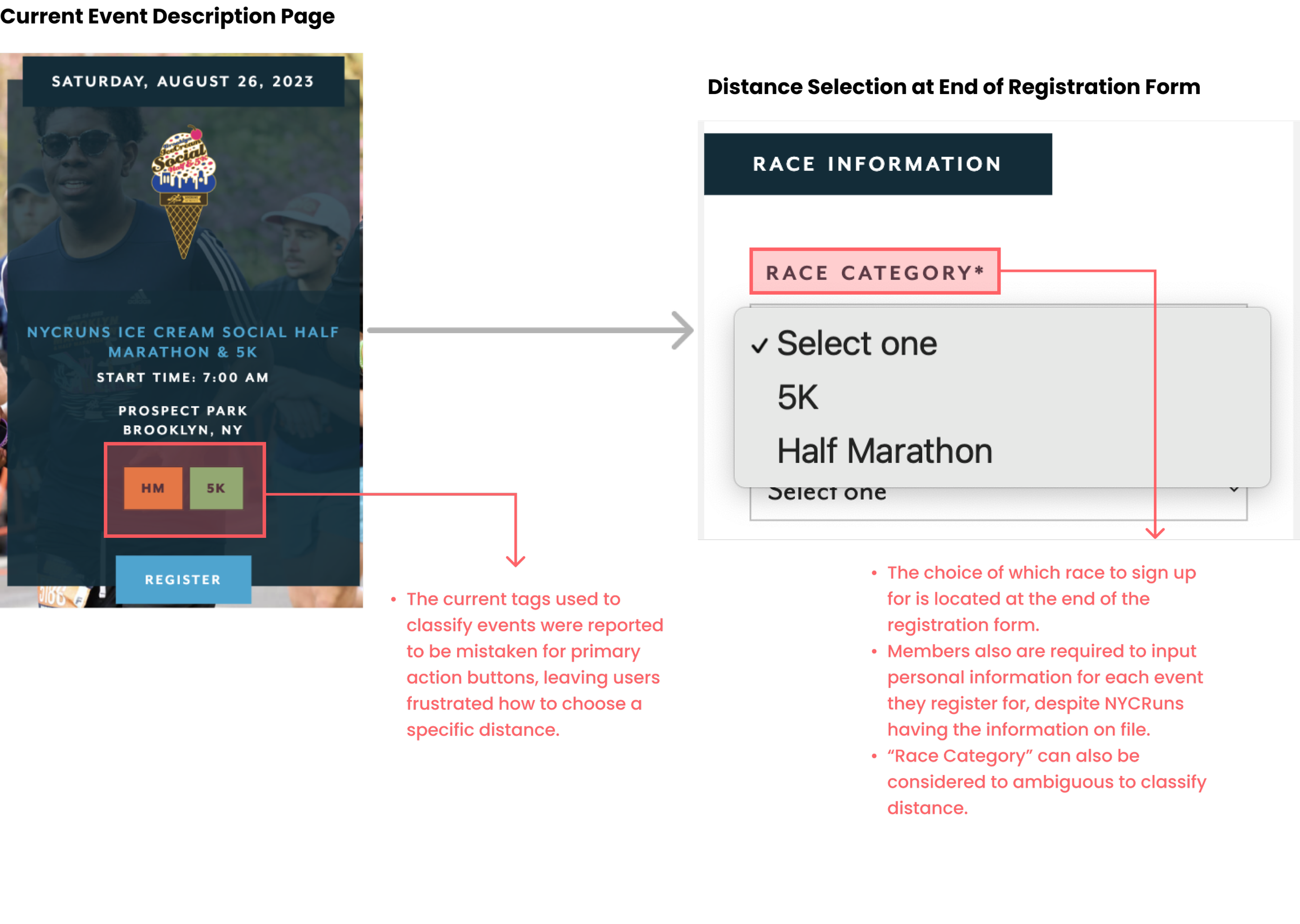
Currently, NYCRuns has many events that offers runners a choice of which distance they would like to run. Distances are displayed in bright colored boxes resembling buttons and overpower the primary button to register.
Potential race participants are not required to make a distance selection until the end of the following information form, causing potential for user error. User error in this instance could cause race participants to accidentally sign up for a half marathon (13.1 miles) instead of a 5K (3.1 miles)
Task Flow 2: Check Individual Race Results
When checking individual results from user dashboard, no option to go back to the dashboard is offered.
An option to view all race participants for that chosen race is offered leading to possible user error.
Task Flow 3: Create Account
Many flows, including creating an account, have repetitive paths offered leaving users unsure at which path to take.
Low Fidelity Digital Wireframes
Goal: Streamline Essential Information
A cleaner, user-friendly interface that aims to enhance the overall user experience for race participants was desired by interviewees. The wireframe serves as a starting point for the NYC Runs redesign, highlighting the proposed improvements in functionality, usability, and aesthetics to create an engaging and efficient platform for runners of all levels. Key features include:
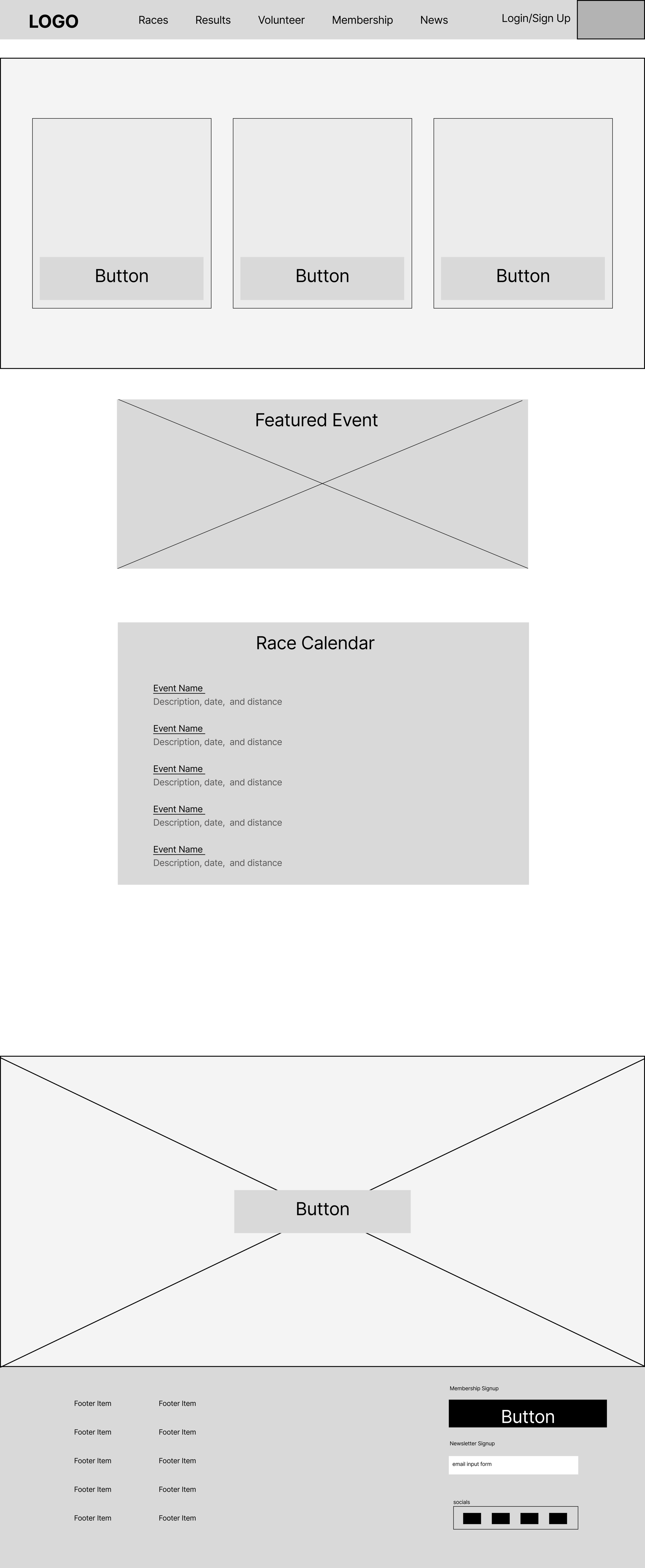
Landing Page: The redesigned home page presents a streamlined layout with clear navigation options. It prominently displays upcoming races, featured events, and personalized recommendations based on user preferences.
Race Search: Improved race search functionality, allowing users to filter races by location, distance, date, and difficulty level. A map view provides a visual representation of race locations, aiding users in choosing events convenient for them.
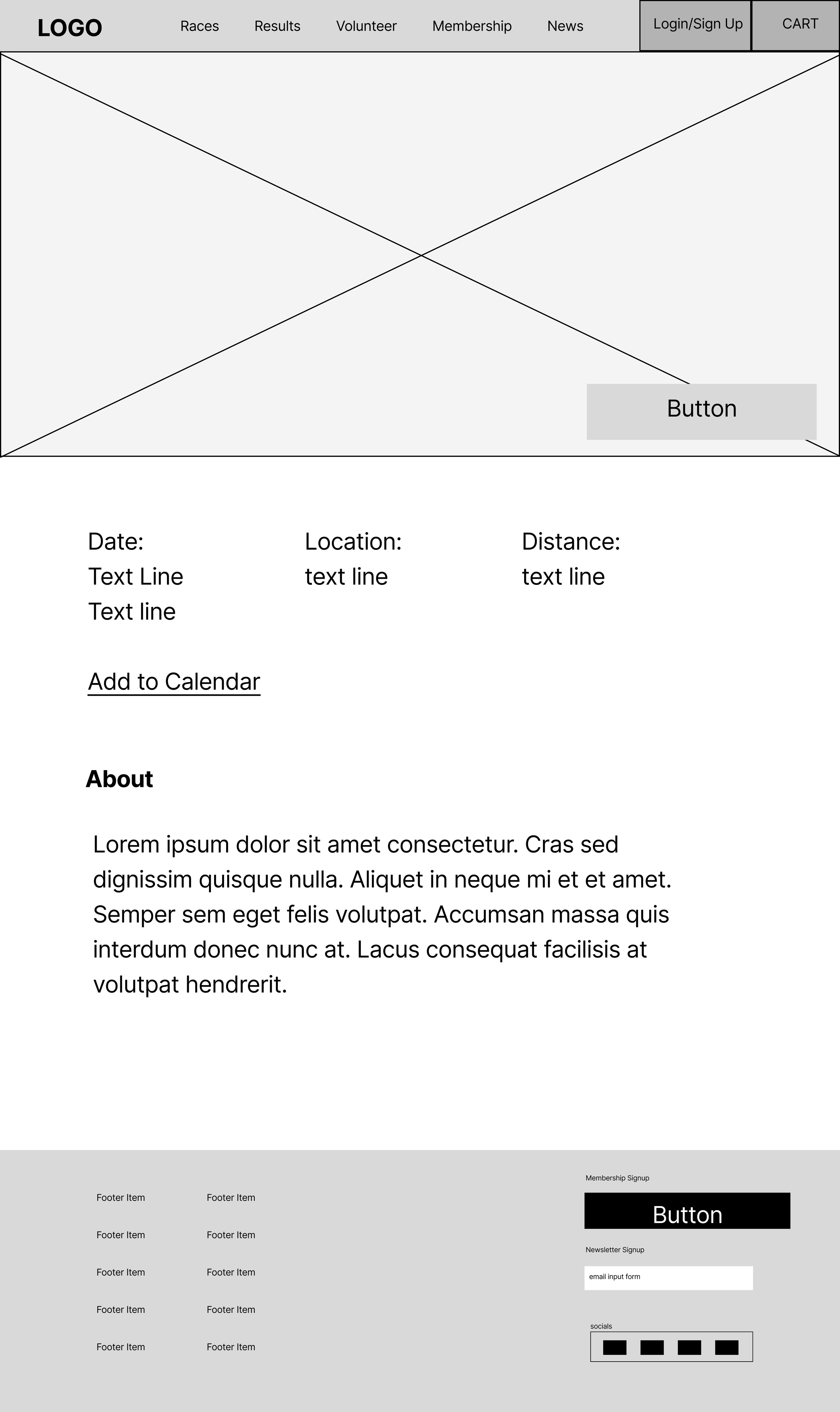
Race Details: Users can access comprehensive race details, including distance, date, location, elevation, course map, and participant reviews. Clear calls-to-action for registration and race updates are prominently displayed.
User Profile: The wireframe includes a user profile section where runners can manage their personal information, track their race history, and view their achievements and progress over time. This encourages engagement and fosters a sense of community.
Mobile Responsiveness: The low-fidelity wireframe showcases a mobile-first design, ensuring a seamless experience for users accessing the website on various devices.
Runner Dashboard (Desktop & Mobile)
Event Description Page (Desktop & Mobile)
Landing Page (Desktop & Mobile)
Cart
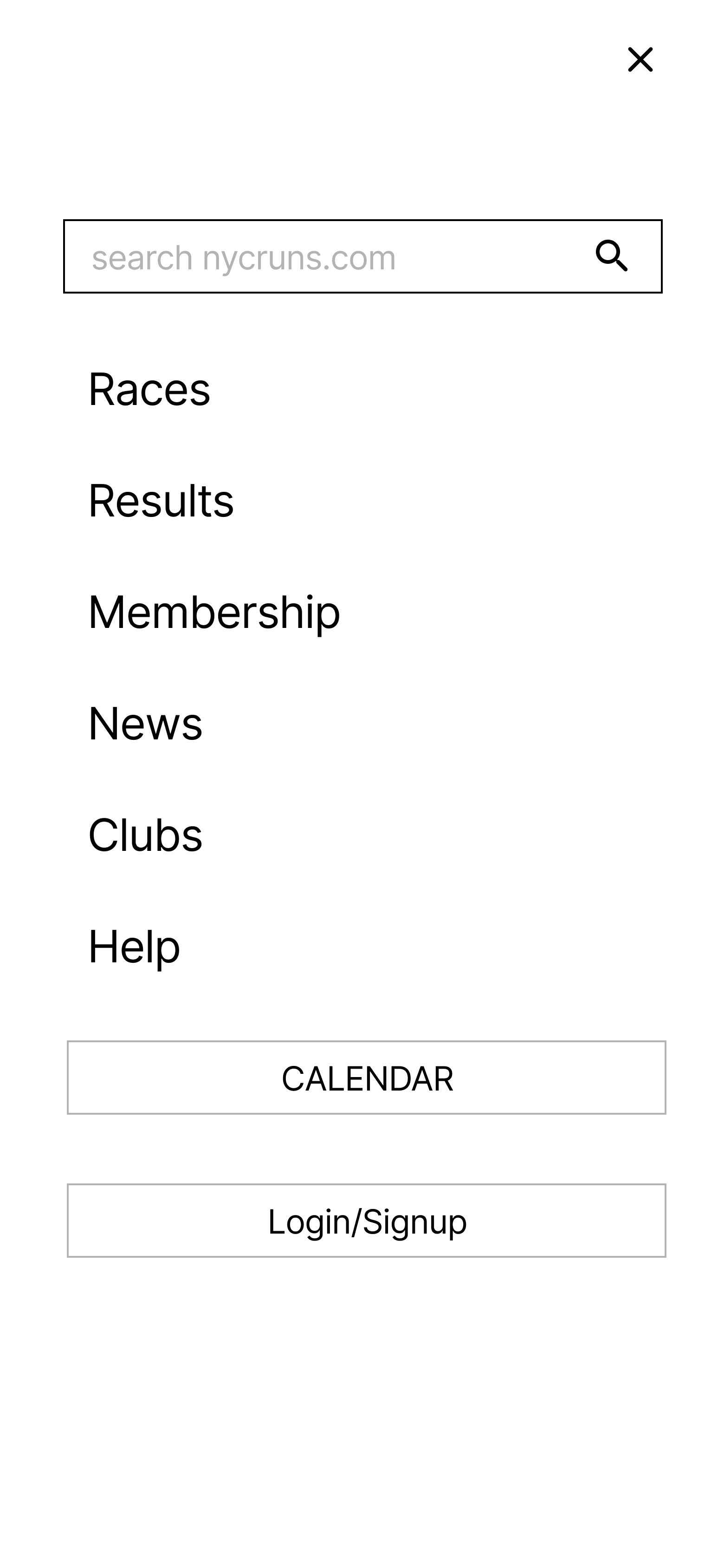
Menu
Version 1: Updated UI Kit with Original Brand Color Palette
Original color palettes left users confused how to initiate tasks due to the lack of a primary CTA color. When first developing a new design system, the original color ways were kept consistent with the current site. However, when moving on to high fidelity wireframes much of the key information felt cluttered and overshadowed by the number of bright colors. To amend this, the second iteration included a more focused color palette.
Design System and Rebranding
Version 2: Revised UI Kit with New Color Palette
Accessibility and Contrast: The color palette was designed with accessibility in mind. Sufficient contrast between background and text colors was maintained to ensure readability for all users, including those with visual impairments.
Consistency and Hierarchy: A clear hierarchy of colors was established to guide users through the website. Important elements such as call-to-action buttons and notifications were given distinctive colors to stand out, aiding users in easily identifying and interacting with key features.
The rebranded color palette aims to create a visually appealing and engaging experience for NYCRuns.com users. It enhances the website's overall aesthetic while maintaining accessibility and usability, ultimately contributing to a positive user experience for both new and experienced runners.
Key Updates
Task 1: Register for a Race
When signed in, users who already have an account with NYCRuns.com will have registration for completed as a default state. Then, they are offered a chance to review information before making a final checkout decision.
Users will be prompted to choose a distance before adding event to cart for races that contain multiple distances on the same day. When clicking the “Add to Cart” button a modal clarifies their distance decision.
Task Flow 2: Check Individual Race Results
It was important for users to be able to easily access previous statistics from old races to track improvement.
The original dashboard left information hidden in secondary and tertiary navigation
Once runners found the event they were looking for, they were directed back to results from all participants of the event, rather than their own dashboard.
Task 3: New Account Onboarding
When creating a new account, users are original faced with a form depicting that information cannot be “self-updated.” Interviewees expressed this messaging was confusing and were hesitant for sign up.
“Create New Account” was reportedly mistaken to be a CTA link and the form below was overlooked by users.
Users are also prompted to leave account creation an explore races and events.
To amend this issue, a more streamlined onboarding process is offered in the redesign.
High Fidelity Prototype
Accessibility Considerations
Clear and Concise Language: Use plain language and concise wording to enhance comprehension for users with cognitive disabilities or reading difficulties. Avoid jargon, complex sentence structures, or excessive use of technical terms.
Color Contrast: Ensure sufficient contrast between text and background colors to make content easily readable for users with visual impairments or color blindness. Use tools or guidelines to verify that the color combinations meet accessibility standards.
Impact
Users expressed a significant positive impact of interactive features resulting in improved engagement and increased willingness to participant in a NYCRuns event.
Through a streamlined navigation structure, intuitive race search functionality, and clear calls-to-action, the redesign aimed to make it easier for users to find and register for races, fostering a seamless and efficient process. The result was an enhanced user interface that optimized usability, ultimately contributing to a more enjoyable and user-friendly experience for runners of all levels.
Usability testing included feedback from 12 participants, who generally expressed positive feedback regarding the new visual design, noting that it appeared "less busy" and "simpler" compared to the previous version. While participants generally praised the redesign, there were instances where they faced challenges while trying to add races to their cart. As a potential solution, participants suggested implementing a notification system for the cart, although it was noted that this feature was limited due to constraints imposed by the prototype.
Participants had a smooth experience with the registration process and checkout, successfully creating accounts and checking race results after logging in. They found the search bar easily accessible but were initially confused when it didn't work, realizing later that it was due to limitations of the prototype.
One participant requested a feature to view race results for the entire race, in addition to individual feedback. They initially had questions about when to sign in but quickly discovered the profile avatar in the navigation bar, enabling them to easily navigate through all three tasks.
Usability Testing
Revision 1: Event Page CTA Language
The revision of the CTA button language transformed the call-to-action from "Add to Cart" to "Register Today." By emphasizing the importance of securing their spot in the race, the new language "Register Today" sought to encourage users in a friendly and motivating manner to take immediate action.
Priority Revisions
Revision 2: Cart Status Update
Based on feedback from usability testing, users found the lack of notification regarding the cart status for races somewhat confusing. To address this concern and alleviate user worries, revisions have been implemented to provide clearer indications of whether a race has been successfully added to the cart.
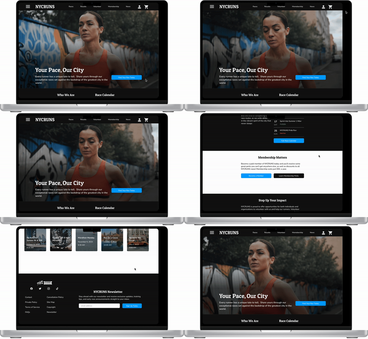
Revision 3: Desktop Landing Page
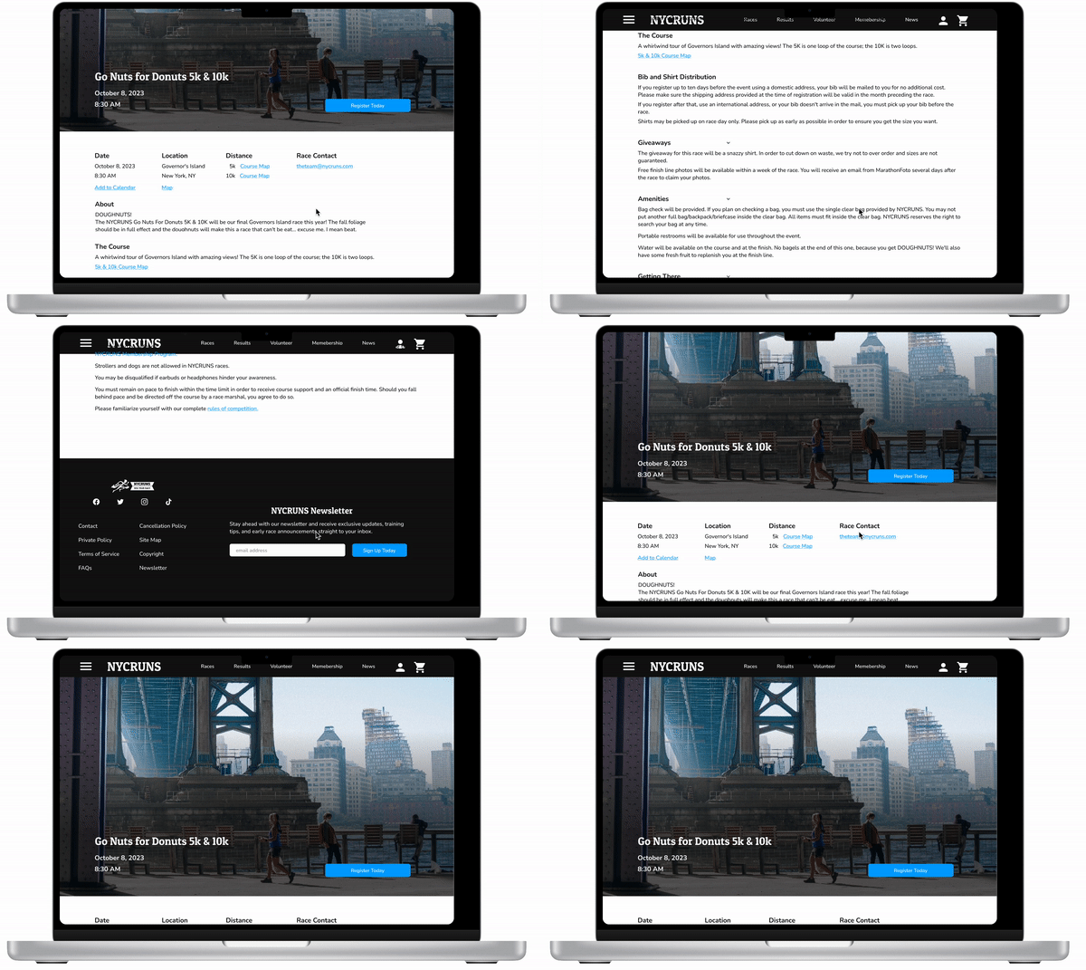
To enhance the original redesign of the desktop landing page, it would be beneficial to focus on improving the information hierarchy for clearer user understanding and a more streamlined design. Moreover, the inclusion of a video in the hero image was implemented to actively engage and inspire users by showcasing the exciting possibilities of participating in a running race. These refinements aim to create a more impactful and compelling user experience.
Original Landing Page Redesign
Revised Landing Page Redesign
Task Clarity: Increased clarity helped improve usability and runner engagement. A more distinctive and high contrast color palette offered clearer calls to action for users. Additionally, improved copywriting helped users become more confidence that their actions led to the desired outcomes.
Intuitive UI: Additions of more intuitive design elements prevented users from abandoning registeration for a race, or let apprehensions about setting a new physical goal get in the way of completing registration. Users did not spend any additional unnecessary time while completing checkout, taking away the opportunity ot second guess the choice. When signing up, users reported confidence in their decisions.
Highlight Key Information: The dashboard redesign emphasizes information that runners are most interested by placing them front and center.
Conclusion
Takeaways
Next Steps
Upon reaching out and submitting the designs to the leadership team, the next step in the redesign process of NYCRuns involves gathering feedback from stakeholders. The feedback received will serve as valuable input for the creation of future design iterations. These iterations will carefully consider the suggestions and insights provided by the stakeholders, with the ultimate goal of refining and enhancing the user experience of NYCRuns. By incorporating the feedback and making the necessary improvements, the redesigned platform will become more user-friendly and better equipped to meet the needs of its target audience. The iterative nature of this process ensures that NYCRuns evolves and adapts based on the valuable input received from stakeholders, leading to an improved overall user experience.


